Contact Us

Please feel free to get in touch to ask a question, schedule an appointment or give us your feedback. We look forward to hearing from you. 

17 Divinity St
Bristol, CT, 06010
United States

8605895155

Since 1975, O'Donnell Bros has been providing greater Bristol and Central Connecticut with residential and commercial remodeling solutions. We specialize in roofing, siding, windows, doors, gutters, downspouts and so much more. We look forward to helping you with all your remodeling needs. 

HomeImprovement-PT-050114_9032 (1).jpg

Articles

O'Donnell Bros President, Bob O'Donnell, is a regular contributor to The Bristol Press. Read his home improvement articles here.


Filtering by Tag: color

All the Colors for 2026

Chelsea O'Donnell

Every year, paint companies roll out their “Color of the Year.” Sometimes they’re bold. Sometimes they’re confusing. For 2026, the big takeaway is this: things are calming down. These colors are practical, livable, and meant for real homes, not show houses.

If you’re thinking about repainting a room, updating a front door, or planning a bigger renovation, these six colors from the most popular paint brands are worth a look.

1. Pantone – “Cloud Dancer”

Pantone surprised a lot of people this year by choosing a soft white. “Cloud Dancer” isn’t bright white and it’s not gray but it does sit comfortably in between. Think clean, calm, and easy.

Where it works:

  • Inside: Living rooms, hallways, and kitchens, especially if your home doesn’t get a ton of natural light. It keeps things bright without feeling cold.

  • Outside: Trim, porch ceilings, or even siding on smaller homes. It freshens things up without screaming “new paint job.”

This is a great option if you’re selling soon or just want something you won’t get tired of.

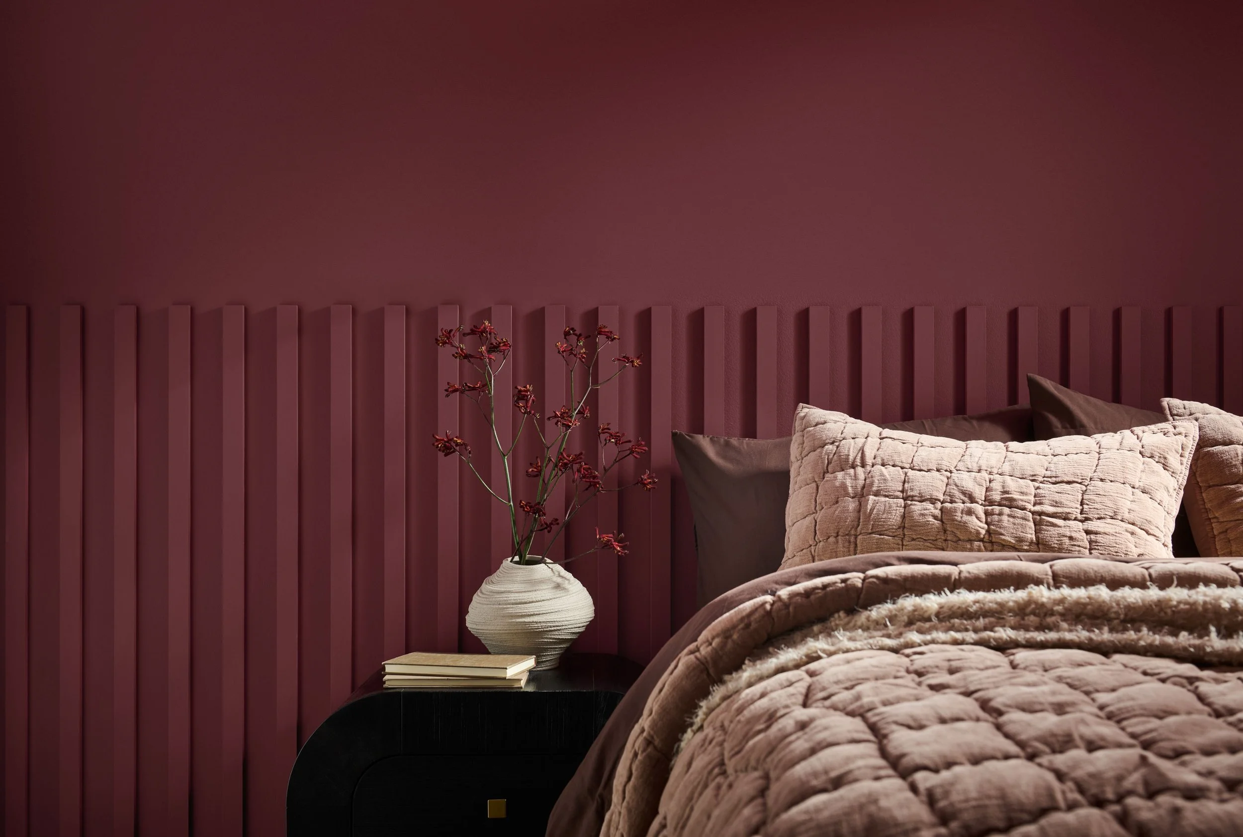
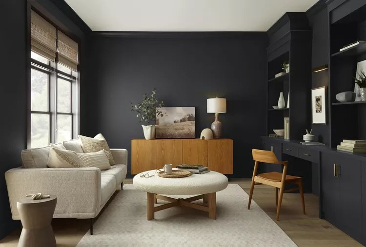
2. Benjamin Moore – “Silhouette” (AF-655)

This one’s a deep brown with charcoal undertones. It’s dark, but it doesn’t feel heavy. Think espresso, not black coffee.

Where it works:

  • Inside: Offices, dining rooms, built-ins, or an accent wall behind a TV or fireplace.

  • Outside: Front doors and garage doors. It pairs nicely with white trim, stone, or brick.

If you want contrast without going full black, this is a smart move.

3. Sherwin-Williams – “Universal Khaki” (SW 6150)

This is one of those colors that just works. It’s a warm beige-tan that doesn’t lean yellow or gray.

Where it works:

  • Inside: Open floor plans, living rooms, and family rooms where you want continuity.

  • Outside: Siding, especially on Colonials, Capes, and ranches. It plays well with almost any roof color.

If you’re nervous about color, this is your safety net.

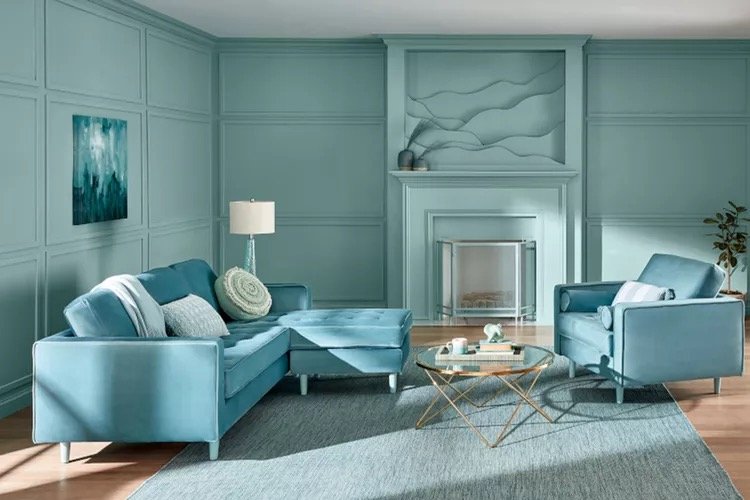
4. Behr – “Hidden Gem”

A smoky green-blue that looks bold on a paint chip but surprisingly calm on the wall.

Where it works:

  • Inside: Kitchen islands, bathroom vanities, or an accent wall in a bedroom.

  • Outside: Shutters or front doors if you want personality without going too trendy.

It’s a good “one-room” color, just don’t put it everywhere.

5. Valspar – “Warm Eucalyptus”

This is a soft, muted green with gray undertones. It feels relaxed and grounded.

Where it works:

  • Inside: Bedrooms, home offices, or reading nooks. It’s easy on the eyes.

  • Outside: Trim or doors, especially if your yard has mature trees or landscaping.

If you like green but don’t want it to feel like a forest, this one keeps things balanced.

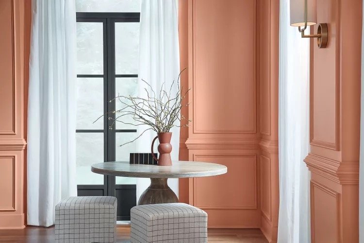
6. Glidden – “Warm Mahogany”

A rich reddish-brown that adds warmth without looking dated.

Where it works:

  • Inside: Dining rooms, accent walls, or kitchen islands.

  • Outside: Front doors and shutters—especially on lighter homes.

This color feels solid and classic, which is why it works so well on older New England houses.

My Advice

The 2026 colors are less about making a statement and more about making your home feel comfortable. Whites are warmer, neutrals are richer, and color shows up where it counts: doors, cabinets, and accents.

If you’re painting to enjoy your home, stick with the softer shades. If you want curb appeal, use the darker colors sparingly where they’ll stand out for the right reasons.

Bob O’Donnell is the owner of O’Donnell Bros, Inc., a Bristol-based home improvement company established in 1975. Email your questions for Bob to info@odonnellbros.com with the subject line “Ask the Pro.” All questions may be considered for publication. To contact Bob for your remodeling needs, call O’Donnell Bros, Inc. at (860) 589-5155 or visit www.odonnellbros.com. Advice is for guidance only.

The 2025 Interior Colors of the Year

Chelsea O'Donnell

As we look ahead to 2025, paint companies have begun unveiling their "Colors of the Year," a selection of shades set to influence interior design trends and inspire homeowners. While previous years have felt in sync, 2025 sets a wider cast, favoring deep, bold colors in line with serene, nature-inspired hues. Here are the key colors each of the major brands are putting their bets on for the coming year.

Behr: Rumors

Behr has chosen "Rumors," a deep ruby red, as their Color of the Year for 2025. This rich and inviting hue is designed to bring warmth and energy to any space. "Rumors" is versatile enough to be used as an accent color or as the primary shade in a room, offering a bold yet sophisticated statement. Whether on a feature wall, cabinetry, or even exteriors, this color aims to create a cozy and dynamic atmosphere​.

Valspar: Encore

Valspar’s pick, "Encore," is a striking ultramarine blue with a violet undertone. This color evokes a sense of confidence and constancy, making it ideal for creating a peaceful, yet vibrant environment. "Encore" pairs beautifully with softer shades like sage and lavender, which help to enhance its boldness while maintaining harmony within a space. It’s a color that encourages creativity and serenity, perfect for bedrooms, living rooms, or creative spaces​.

HGTV Home by Sherwin-Williams: Quietude

"Quietude," selected by HGTV Home by Sherwin-Williams, is a soft sage green with subtle blue undertones. This color is part of the Naturally Refined 2025 Color Collection, which emphasizes tranquility and enduring design. "Quietude" brings a soothing, natural feel to any room, making it a perfect choice for spaces meant for relaxation, such as bedrooms or living areas. Its gentle hue connects us with nature, fostering a sense of calm and retreat from the hustle of daily life​.

Dutch Boy: Mapped Blue

Dutch Boy Paints has introduced "Mapped Blue" as their Color of the Year. This mid-tone blue is described as timeless and versatile, with a slight yellow undertone that adds warmth. "Mapped Blue" is ideal for creating a serene backdrop that adapts well to various styles and color schemes. Whether used in bedrooms, bathrooms, or even living rooms, this color promises to bring a sense of calm and continuity to the home​.

WGSN & Coloro: Future Dusk

"Future Dusk," a collaboration between WGSN and Coloro, represents a deep, moody blue-purple. This color sits between the realms of reality and fantasy, evoking the mystery of twilight. It’s a color that offers both reassurance and inspiration, making it suitable for a range of applications, from accent walls to entire rooms. "Future Dusk" is about embracing the unknown and finding beauty in the darker, more enigmatic aspects of life​.

Minwax: Violet

For those who favor a more whimsical touch, Minwax’s "Violet" offers a playful yet sophisticated option. This shade of purple is vibrant without being overwhelming, making it a great choice for those looking to infuse their space with personality and creativity. "Violet" is especially suited for accent pieces or feature walls, bringing lively energy into any room​.

One thing is for sure, the 2025 color projection is not for the faint of heart. Between bold blues and deep purples to shades on the softer side, there is something for everyone. If you’re feeling skeptical, ease in with an accent color or refresh your interiors with textiles that are simpler to update. A few small changes can often make a home feel brand new.

Bob O’Donnell is the owner of O’Donnell Bros. Inc., a Bristol-based home improvement company established in 1975. Email your questions for Bob to info@odonnellbros.com with the subject line “Ask the Pro.” All questions may be considered for publication. To contact Bob for your remodeling needs, call O’Donnell Bros. Inc. at (860) 589-5155 or visit http://www.odonnellbros.com. Advice is for guidance only.

Credits: The Spruce, Real Simple, The Nordroom

Interior Design Colors of the Year 2024

Chelsea O'Donnell

Every autumn, all the major paint brands and color influencers choose a specific shade that sets the mood for the year to come. Influenced by what’s happening in the world around us as well as trends in fashion, design, and pop culture, the “Color of the Year” is chosen to give people inspiration for how to design and decorate their homes. While each major brand goes its own way, there are sometimes overlaps or themes that really set the tone for the upcoming season. Here is a sneak peek of what we will soon see in homes across social media, according to the big names in color. 

Limitless by Glidden for PPG

Anything but white, this creamy neutral shade is warm and inviting, the perfect pick-me-up that still pairs well with a wide-ranging palette. A beautiful canvas for warmer tones, it works well for walls, trims, and cabinets, setting the stage for more dramatic design elements. If you love neutral colors but are tired of dominant whites and grays, this is the hue for you. 

Renew Blue by Valspar

A sleepy shade of soft sky blue, this shade for 2024 offers off-season coastal vibes when the weather turns, the beach is quiet and everything feels calm and meditative. Think fog, mist, clouds, and everyday earthy elements that lean towards restoration and reflection.  This color looks beautiful when paired with other blue and gray tones and really pops with a contrast of gold. 

Cracked Pepper by Behr

A deep charcoal hue that adds style and elegance to any room and makes for a perfect alternative to black. The softness enables this color to fit in as comfortably in a modern farmhouse aesthetic as it would in a more industrial and modern apartment. If you’ve ever wanted to paint a whole room black but your nerves got the best of you, this is the color that fits the bill. 

Persimmon by HGTV Home by Sherwin-Williams

The most vibrant of the picks so far, this color offers the warmth of a Tuscan country estate. A far cry from Barbie, this is pink all grown up with a sophistication that feels elegant and inviting. Warm orange tones bring a nice balance to this color, especially when paired with tans, mossy greens, and deep gray-blues. It’s unique and unexpected but won’t go out of style anytime soon. 

Ironside by Dutch Boy

Army green with an upscale edge, this 2024 pick feels ultra-earthy and sets the stage for settling in. We like the way Dutch Boy uses Ironside as an alternative trim color to typical white or black tones, pairing the deep green with peach and blue hues for a look that’s unique. We would pick this for a masculine retreat, office, or as a way to bring nature into the home. 

Bob O’Donnell is the owner of O’Donnell Bros. Inc., a Bristol-based home improvement company established in 1975. Email your questions to info@odonnellbros.com with the subject line “Ask the Pro.” All questions may be considered for publication. To contact Bob for your remodeling needs, call O’Donnell Bros. Inc. at (860) 589-5155 or visit http://www.odonnellbros.com. Advice is for guidance only.